Dustin, hi!
Let’s break down the questions.
Figure S4A
Images in the figure S4A were generated using the qunex run_qc command. See section “BOLD FC QC for scalar and pconn data” in the command documentation for the details of how to run this command.
The run_qc command for functional connectivity QC requires that parcelated functional connectivity was already computed and that either a parcelated GBC or parcellated connectome file is present for each bold image in sessions/<session_id>/images/functional. For instance:
bold[N]_Atlas_hpss_res-mVWMWB_lpss_CAB-NP-718_r_Fz_GBC.pscalar.nii
as an example of parcellated GBCbold[N]_Atlas_hpss_res-mVWMWB_lpss_CAB-NP-718_r_Fz.pconn.nii
as an example of parcellated connectome file
The CAB-NP-718 refers to Cole Anticevic Net Parcellation, for which the files are also included in the qunex library.
The example files listed above were generated as part of a run_turnkey QuNex command, which we have since deprecated and has been replaced by the run_recipe functionality. They can now be computed using the parcellate_bold command.
If you go this route, take notice that the file names of the results will depend on the input to parcellate_bold and will probably not match exactly the defaults expected by run_qc. You will need to provide the exact “tail” of the filenames (after the bold[N]_ start) using the --boldfcinput parameter.
These commands will work on each bold separately and assume resting state data. If you would like to compute task-based functional connectivity or resting state functional connectivity over more than one bold, then use the latest functional connectivity commands, which provide more flexibility and control.
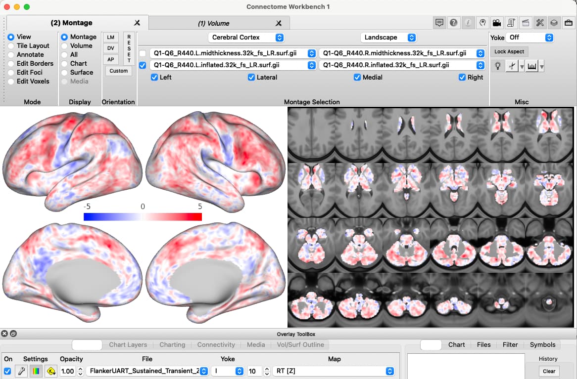
If you then want to visualise the data, you can use and adjust one of the template scenes provided in the qunex library to use with wb_view.
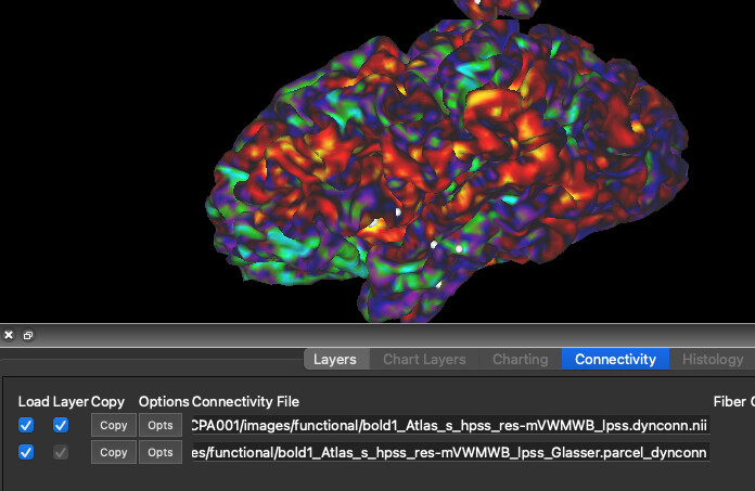
dyconn files
As you have identified yourself, the functionality demonstrated in the wb_tutorial requires a .dynconn.nii file. This file includes N*N matrix of correlations between each pair of grayordinates, where N is the number of grayordinates. These files take lots of space, about 33GB. They are great for dynamic visualization of the connectivity, but we have never used them in research where we are focused on functional connectivity between specific ROI and/or networks, or a summary result, like a GBC map. For this reason we have not added the functionality to compute these images in QuNex. You can generate such files manually using wb_command, e.g. wb_command -cifti-correlation that is included in the QuNex container.
Difference between GBC and seedmaps
The fc_compute_gbc will allow you to compute a Global Brain Connectivity map. GBC map shows for each grayordinate (or parcel if you compute it on parcellated data), what is its average functional connectivity with all other grayordinates (or parcels) across the brain. The command provides numerous options on what specifically you want to compute (e.g., Pearson’s r, covariance), whether you would like to compute average across all, just positive, just negative or absolute correlations, you can limit computation to specific regions of the brain as the source and target of computing functional connectivity. The map will tell you, how strongy a region is connected with the rest of the brain. Regions with very high GBC values are often considered hubs (see Cole, Pathak, and Schneider, 2010).
The fc_compute_seedmap will compute a map that will tell you for each grayordinate in the map (or each parcel, if you are providing parcellated bold as input), what its functional connectivity is with the source region, i.e., the “seed”. Depending on the options provided, the command will result in a dscalar.nii or pscalar.nii files that may include multiple volumes, for instance, one for each specified seed region.
Both commands can run over multiple subjects/sessions, they can compute correlations over concatenated bold files, work with both resting state and task-based data, they can save results for each individual subject as well as group results. You can visualise the results easily using wb_view or subject them to further statistical analysis and testing, e.g., using run_palm (see also Group-level statistics and mapping results).
I hope this helps!
All the best,
Grega